TRIOSE
A Fresh Brand for a Healthcare Logistics Challenger
The
Challenge
Our
Approach
The
Result
TRIOSE, a growing healthcare logistics company with an aggressive expansion plan was in need of greater brand awareness to achieve its goals. Despite offering unique and effective solutions, it was difficult to cut through the noise of their larger competitors in the industry. They needed to validate their brand’s position, develop a strategy to put their message in front of a wider audience, and move forward with a clean and cohesive look.
TRIOSE turned to D2 Creative for a fresh perspective. In such a competitive marketplace, it was critical to keep customers and their needs first and foremost. Holding a Brand Discovery Workshop can define those customers and needs, as well as how TRIOSE directly solves them.
Our goal was to build TRIOSE a unique and ownable position in the market that their competitors couldn’t reach. Through our brand workshops, we identified key differentiators, which included their personalized, customizable solutions and hands-on, white-glove service.
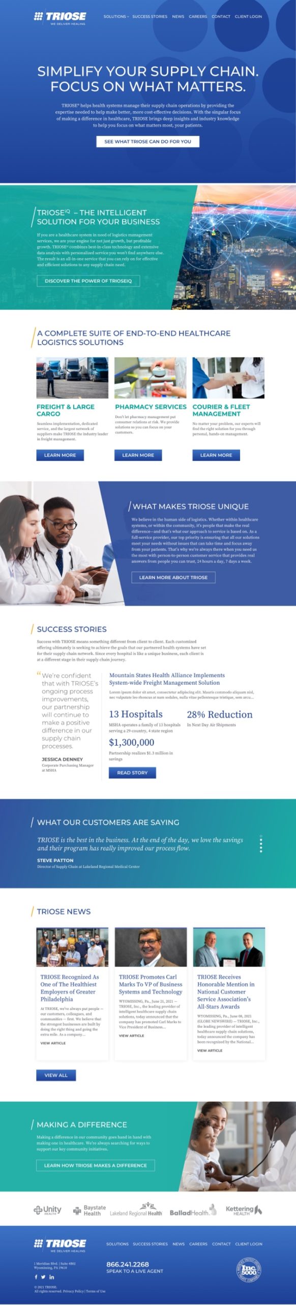
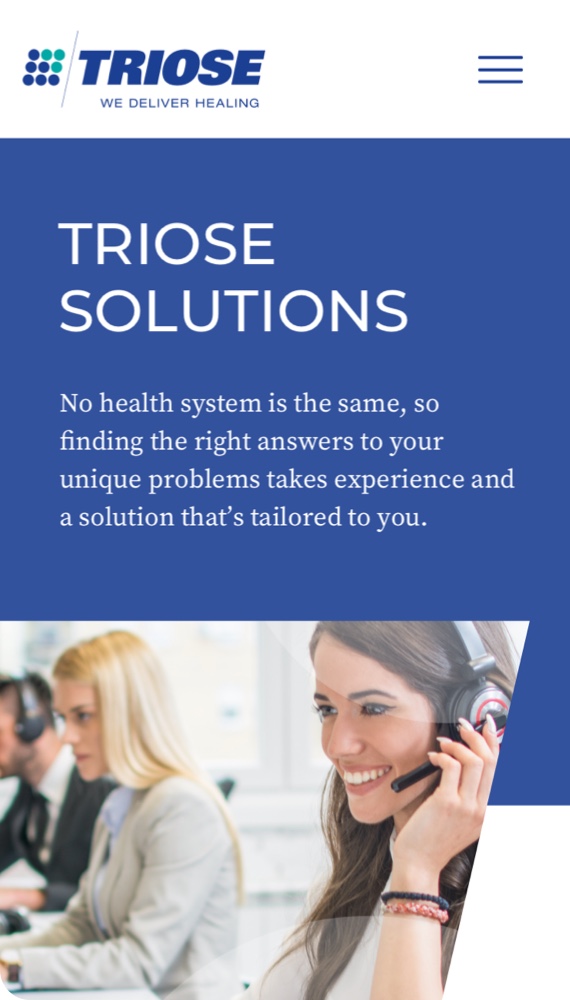
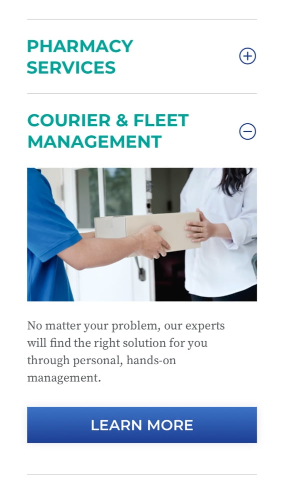
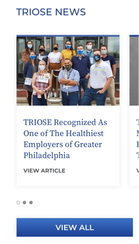
But, showing these benefits to healthcare systems required changes to how the company presented itself. Their current branding struggled to tell consumers what it was that set TRIOSE apart, so we set out to change that through an overhaul of their online presence. We updated their website with an enhanced visual identity, which incorporated a more comprehensive color palette that highlighted the brands organizational attributes, and an expanded image library into a cohesive brand style. We then channeled this new brand into a complete overhaul of their existing content to ensure their site could truly speak to the offerings, benefits, and story of TRIOSE.
The rebranding helped give TRIOSE the edge it needed to carve its own niche in the healthcare logistics industry. With a higher focus and more visibility on the things no other company could provide, TRIOSE gained the foothold they needed to grow their place in the market.
Having a fresh understanding of the brand, its audiences, and their needs also helped D2 Creative and TRIOSE more easily leverage digital advertising tactics to target prospects and market to them. The brand validation efforts were further supported by the creation of our “What If” campaign message and theme, accompanied by an ambitious video and digital marketing effort built to show potential partners the unique ways in which TRIOSE is equipped to meet the challenges of today’s healthcare systems.
BRANDING
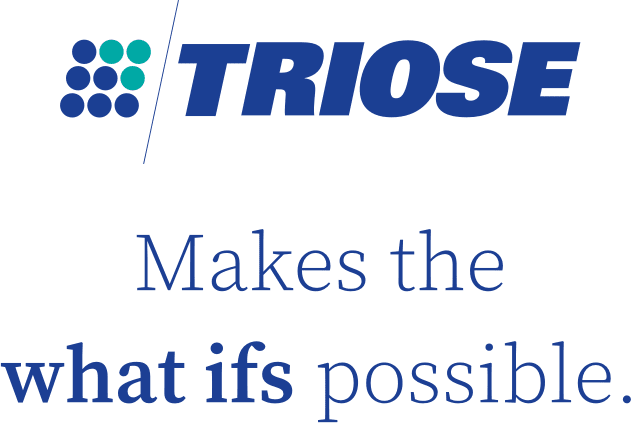
A triose (ˈtrīōs) is a monosaccharide, or simple sugar, containing three carbon atoms. It’s a “building block of energy.” The teal “dots” that are incorporated into the visual identity represent the organization’s original core offerings while the deep blue “dots” represent the broader offerings TRIOSE has developed over the years as it continues to realize its position as a true leader in providing solutions.
VISUAL IDENTITY

TYPOGRAPHY

To help provide a consistent, unified look in the brand’s use of typography, Montserrat and Source Serif Pro typefaces should be used on all communications.
Montserrat was inspired by the old posters and signs in the traditional Montserrat neighborhood of Buenos Aires. This supports the Competent personality dimension of TRIOSE through its geometric sans-serif letterforms. Geometric sans-serif typefaces build on geometric shapes like near-perfect circles and squares. It represents minimalism, simplicity, and cleanliness. The style has been adopted by many leading and progressive organizations and is considered uniquely American.
Montserrat is countered with Source Serif Pro. Source Serif Pro is a serif typeface designed to complement modern sans serif typefaces. Although this is a traditional letterform that reflects the Sincere personality dimension of TRIOSE, the shapes are simplified and highly readable on-screen.
PHOTOGRAPHY

PEOPLE
Represents the people-to-people service TRIOSE provides. These can be representative of the TRIOSE team or their customers. These can include people working in small groups, collaborating, focusing, and thinking. They can include a single person or larger groups of three to four. People should not be looking at the camera or look staged. These should feel candid and reflect compassion, collaboration, and a sense of pride.
Photography

HEALTHCARE AT WORK
These images represent healthcare workers in service, focusing on the patient because TRIOSE has delivered for them. These images should be tight, focused, and compassionate. They can highlight the hospital items that TRIOSE makes possible—there when they need them. These should feel more candid. Subjects should not be looking at the camera.
Photography

INNOVATION
These images represent data flow, analytics, insight, and the concept of “making the invisible visible.” These can include abstract images like connected data points, composited images like location points on a bird’s eye view of roadways, data on computer screens, and close-up views of faces/eyes interpreting the data.
Photography

LOGISTICS/SUPPLY CHAIN
This photography represents the flow of materials, data and commerce. These images can be an abstract representation such as an overhead shot of a complex highway system or more grounded in the day-to-day like packages and parcels being scanned. These should be images of things rather than people.
Web Design & Development